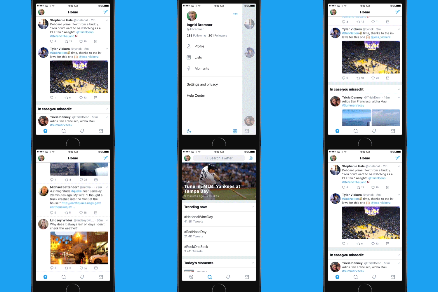
Twitter updated their user interface to a brand new look. Now the site feels lighter, faster, and easier to use. Thanks to feedback from their users.
According to the official blog (found here), Twitter will be rolling out these changes across twitter.com, Twitter for iOS, Twitter for Android, TweetDeck, and Twitter Lite over the coming days and weeks. Here are things you can expect to see:
- Profile, additional accounts, settings, and privacy – all in one place! A new side navigation menu and few tabs means less clutter and easy browsing.
- Links to articles and websites now open in Safari’s viewer in the Twitter app so you can easily access account on website you’re already signed into.
- Twitter refined their typography fonts to make it more consistent and added bolder headlines to make it easier to focus on what’s happening. Also, rounded profile pictures makes it easier to see what people are saying.
- More intuitive icons make it easy to engage with Tweets – especially if you’re coming to Twitter for the first time.
- Tweets now update instantly with reply, Retweet, and like counts so you can see conversations as they’re happening – live.


